
SaaS Email Confirmation Page: Unlocking the Secrets in 2025
Introduction:
Signup is the doorway to every new journey. The SaaS email confirmation page is the first digital handshake between the user and the SaaS product. Therefore, the page must make a lasting impression and ensure that the user feels confident and clear about moving forward.
Just imagine, you have booked a ticket but haven’t received any confirmation email, you start panicking, whether the booking was confirmed or you have just lost your money.
SaaS email confirmation page avoids such uncertainties by building trust, security, and ensuring smooth onboarding of new users.
This guide will assist you in delivering a frictionless first impression for your product. It will update your knowledge on how to design this page, what mistakes to avoid, where the future is heading, and why this page actually matters.
Let’s start finding answers to all these questions.
What is the SaaS Email Confirmation Page?
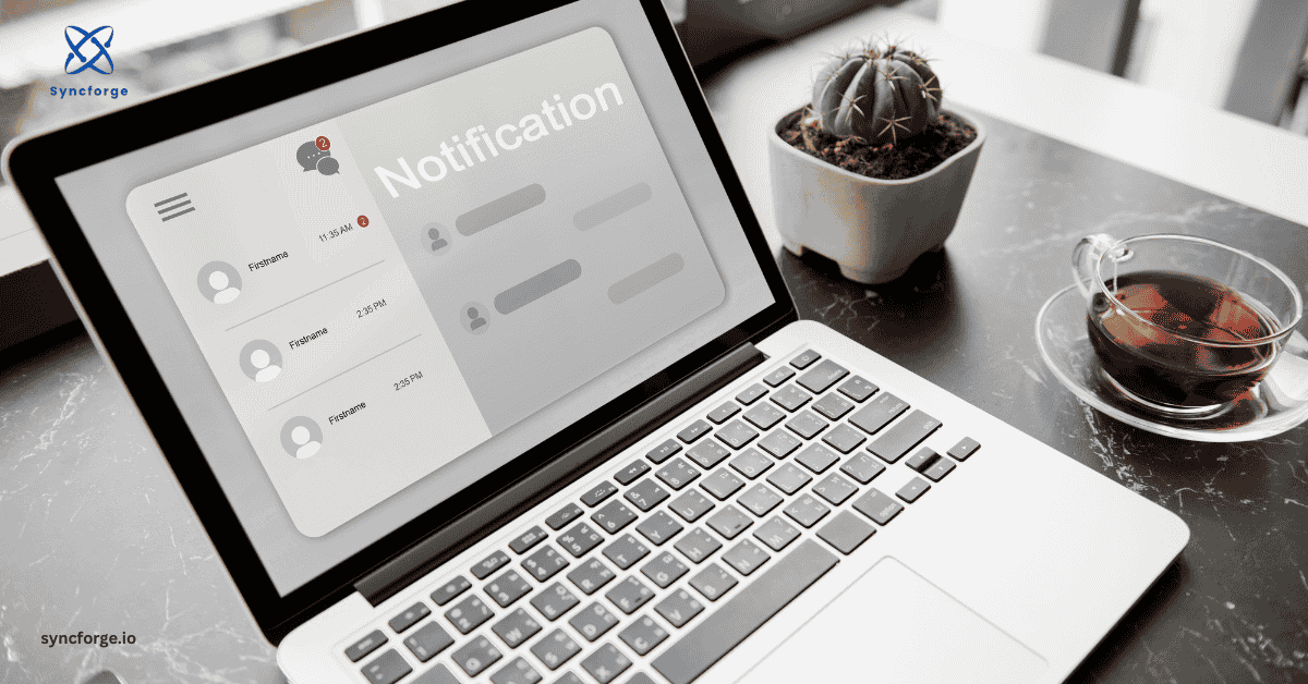
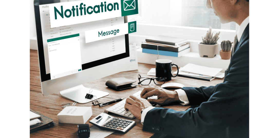
Whenever you sign up for any page, or specifically SaaS, it asks you to confirm your email. After signing up, they send you a confirmation email having a link. After clicking that link, you land on a webpage. That specific page is the SaaS email confirmation page.
After verifying the user’s email, this page tells the user how to proceed further and also includes some CTA or additional information about the product or service.
Such as “Log in to your account” or “go to the dashboard”
Why a SaaS Email Confirmation Page Matters?
The confirmation page looks small, but it does big work as it acts as a sign of trust, a conversion catalyst, and a security filter. It is much more than a checkbox. Its duties are listed below:
- Prevent spam & fake signups: Fake accounts can eat your growth slope and resources. No platform wishes to send their marketing emails to robots. So the confirmation page helps platforms to filter bots and protect their databases by asking to verify emails.
- Improves trust & Credibility: First impression matters a lot. A professional page having clear instructions for further processing or a CTA boosts users’ confidence in your product. User assumes your product to be efficient when their first interaction with your page is premium.
- Smooth onboarding: Users usually drift away and forget about your platform due to the abrupt stop after the signup. However, the SaaS email confirmation page keeps the users engaged by making them busy in setting up profiles, exploring the dashboard, or starting a free trial.
- Boost Conversions: Many users go away after activating their accounts, but a strong call to action keeps them busy. For example, “set up your first project” or limited-time offers.
Key Elements of an Effective Confirmation Page
The blend of all the following elements contributes to designing an effective SaaS email confirmation page:
- Clear Success message: Giving a clear confirmation message to users leaves no room for ambiguity. It instantly lets the user know that their email has been verified. Avoid jargon and choose user-friendly language. For example, “Your email has been verified! Welcome to [Product Name]
- Strong Call to action (CTA): Don’t let them go away, invite them to do something with a strong call to action that is hard to resist. The call to action should be prominent, so it can catch the user’s eye. You can give the following few suggestions with a bright button:
“Set up your account”
“Start your 7-day free trial” and explore the premium features
- Consistent Branding: There should be harmony among all the elements of your website, so that users find it visually appealing. Users became habituated to the typography, colors, and logos of your website. So, it is better to maintain consistency and continuity instead of doing new experiments. They should not feel that they have landed on a different site every other day.
- Friendly and Human Copy: Instead of robotic text, try to approach the users in a friendly manner. For example, instead of saying “Email confirmed! Welcome”, say “ Great to have you, Ali. Let’s get started.”
- Optional Upsell or Helpful Links: The large empty sections on your page make it look incomplete and lazy. Try filling those spaces by adding links to jump to a relevant guide.
Best Practices to follow for SaaS Email Confirmation Pages
A well-crafted and carefully refined page offers clarity and persuasion to the users. It allows users to scan the page at first glance without overwhelming them. Stick to the following best practices for optimal results:
1. Keep it simple: One clear message and call to action are perfect; extra options lead to distraction.
2. Personalize when possible: Try to address them by using their names; these small efforts deliver a valuable experience to them
3. Design for mobile first: Keep in mind that almost 70%+ users check their emails on their mobile phones. Big buttons with small copies are ideal for mobile displays. Your SaaS email confirmation page must be mobile responsive and have fast load times; otherwise, users will be disappointed.
4. Add a Safety Net: A fail-safe method encourages the user for alternative methods if something goes wrong. For example, contact customer support. It assists them throughout the process and reduces their frustration.
5. A/B Test Variations: Compare different colors, layouts, fonts, and CTA for your page and see which version attracts more activations, and then stick to that.
Examples of Strong Confirmation Page Design
- Slack: Slack’s confirmation page is harmonious- just like a still pond. Users are directly landed in their workplace post verification.
- Notion is known for its typography and brand consistency. It provides you with helpful onboarding tips. It gives the user a seamless experience.
Common Mistakes to Avoid:
It is the first interaction, so try to avoid even the small missteps. Below is a not-to-do list:
- Do not use robotic or generic phrases like “email confirmed,” as they give a very cold impression
- Do not skip CTA, as users are new; if they do not know what to do next, they will stall
- Do not break the brand consistency by mismatching the elements of the page
- Do not overload the page with promotions or pop-ups; users may feel annoyed.
- Do not ignore the accessibility; it should be designed for both web and mobile, and font, contrast, and everything should be up to the point.
How to Optimize Your SaaS Signup Flow with Confirmation Pages
While signing up confirmation page should feel like a stepping stone instead of a dead end.
- The ideal sequence of winning a new user must be: Signup Form → Email Verification → Confirmation Page → Dashboard. Make sure that this sequence is smooth without any hindrances
- Continuously track metrics to stay updated about the user behavior after confirmation. Keep a close eye on activation rates and drop-off points.
- Iterate & Improve: Just evaluating the metrics is not sufficient. Collect feedback from users about how they are feeling about your page and work on the areas of improvement highlighted by them
The Role of Email Confirmation in SaaS Onboarding
The confirmation page holds much more than just verifying a user’s identity. Consider it as the first stage of the user onboarding journey. By employing it strategically, you can:
- Encourage profile completion by uploading profile pictures or by completing their profiles, as they will spend more time on your page. Small commitments increase investments.
- Offer a short product tour to users right after confirmation and introduce your key features.
- Provide quick help to first-time users by adding links to FAQs and chat support. So, they do not feel any confusion and run here and there. Make their experience smooth and effortless.
Future Trends in SaaS Email Confirmation Pages
Your product and page must be up to date according to the industry standards. If you are relevant today but stagnant, people will replace you tomorrow.
- Personalized Dynamic Content: Try to communicate with the user through tailored text using data that you have gathered during the sign-up process. For instance, if the user has chosen the free plan during sign-up, show them relevant features to that specific plan.
- Gamification Elements: Use visual progress bars and try to congratulate them with animations instead of dull texts. Persuade them by using small milestones such as “You are just one step away.”
- One-tap App Integration: For mobile-first users, redirect them directly to the application post verification, or towards the most logical part of the application, such as the dashboard or profile setup.
- AI-Driven Messaging: Automatically generate the most relevant copy or CTA based on the user’s predicted behavior by taking the services of Artificial Intelligence.
Frequently Asked Questions:
What is the function of the SaaS email confirmation page?
It verifies user identity, reduces spam signups, and encourages users to take further actions.
What are the key elements that a confirmation page must have?
A confirmation page cannot perform well without strong CTA, a clear success message, consistent branding, and useful links to guide the user through the page.
How to design my page for mobile users?
For mobile-first users, keep the text short but the buttons large, and the loading speed should be fast.
Do confirmation pages have any impact on conversions?
Yes, it has a direct impact. A well-designed page and well crafted CTA earn you users and improves your long-term retention.
Should we upsell on the confirmation page?
Yes, you can, but keep it subtle. It is suggested to pay attention to onboarding first.
Conclusion:
A SaaS email confirmation page is often overlooked, but it holds significant importance in the onboarding process. It is the first interaction with the user after the sign-up. It is a small page but heavyweight.
Along with a security check, it earns you user trust. A successful SaaS email confirmation page must have a strong CTA, consistent branding, and microcopy.
CTA: Learn all you need to know about the Confirmation page in our guide and design your perfect SaaS Email confirmation page today! Explore more about SaaS with Syncforge.